


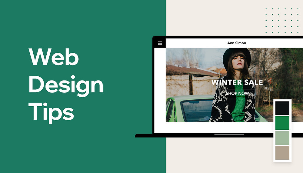
Web Design Tips for Beginners
Start with Wireframing and Prototyping
When starting out with web design, it's important to think about the user experience before starting to code. To accomplish this, wireframing and prototyping can be extremely helpful tools. Wireframing can help you plan out the user's journey through the site, including what kind of information the user will need and which action they should take when they arrive.
Prototyping allows you to create a quick, interactive version of the design. The user can experience the site as if it was already built and can provide valuable feedback along the way. Both of these processes can save time in the long run and help ensure you create the best possible user experience.
Focus on Usability and Accessibility
When it comes to website design, usability and accessibility are key. Make sure your design isn't clunky or overly complicated. Give users a clearly outlined path to follow and ensure that all your website elements are intuitive and easy to use.
In addition, pay special attention to accessibility. Design for users with disabilities, color blindness, or low vision. Make sure the colors you choose have a good contrast ratio. Include HTML tags and attributes which will allow users with disabilities to get the most out of your design.
Optimize for Mobile
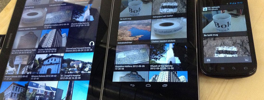
More and more people are using mobile devices to browse the web, so it’s important to design for mobile users first. Use a responsive design that works well on smaller screens and ensure that all your content is easily readable and accessible on all devices.
In addition, make sure that you're optimizing your website for search engines. Include the right meta elements and title tags and make sure your content is properly structured with heading tags.
Test and Iterate
No design is perfect the first time around.Once your website is up and running, it's important to test it out and then iterate the design. Ask people to review your design and take their feedback into account.
Test on a variety of devices and browsers to ensure that your design looks great and works well no matter what device the user is using. Also, use analytics to track and measure user engagement. This will help you understand where users are coming from, where they're clicking, and what content resonates the most.
Don't Forget About Design Principles
Last but not least, don't forget about design principles. Know when to use typography, color, and white space to create a balanced and visually appealing design. When it comes to layout, ensure that there is a logical flow of information and use design elements to guide the user's eye around the page.
By following these tips, you should have an easier time creating great looking, easy to navigate, and user-friendly web designs.
Adaptive vs Responsive Web Design
The Difference Between Adaptive and Responsive Web Design
Are you curious to understand the difference between adaptive and responsive web design? In this blog, we’ll explore how you can adjust your website design to be more suitable for the device it's being viewed on.
Firstly, to give a basic understanding. All websites feature text or images and all websites consist of interlinked web pages, encased in a browser window. However, web design varies as there is an array of different devices of different shapes and sizes. Two of these design approaches are known as ‘responsive’ and ‘adaptive’.
Responsive Web Design
Responsive web design is able to detect the size of the browser window and the device the user is using. This then displays the content, in such a way to fit the device and window size perfectly. Responsive design takes this a few steps further for providing the best user experience. It can detect the size of the device and pick out a set of corresponding parameters. Such as showing larger icons and font size, for mobile devices, which interact better. Taken all in all, responsive design allows a website to become accessible on any device.
Adaptive Web Design
Adaptive design on the other hand, stands separate to the responsive design approach. Instead of detecting a window’s size and resizing the content accordingly, it displays a variety of different versions of the website layout. These designed versions are Precisely aimed at each resolution for better viewing. This is an efficient way of targeting desktop users, mobile users and different tablet users.
Adaptive or Responsive?
Which design is best for you? It depends on what your website objectives are. Responsive design is great for websites who wish to have their content look the same, no matter the device
For instance, newspapers wish to have all their content readers can see on desktops, also seen on mobile devices too. Adaptive design, on the other hand, is great for websites who are products or services as it’ll detect the device type and serve a variation of the same content, fit for that particular device.
Final Thoughts
To summarise, there is a subtle but important difference between adaptive and Responsive design. Both offer users a fantastic user experience for websites, but each design allows for different focuses. Adaptive design is great for websites who want different versions but keeping similar content, and the responsive design is great for those who wish to keep their content the same, no matter the device size.
Go Bold This Year with Tommy Hilfiger Designer Jeans

Style in a Rainbow of Colors
The time has come to update your denim collection for the new season, and Tommy Hilfiger has got you covered - from weekend vibes and bright colors to more bold options for events and night time wear.
The new season’s Designer Jeans from the iconic American brand are all about being bold, taking risks and expressing your own personal style. It’s time to get out of your comfort zone and give the classic blues and blacks a rest, in favor of new rainbow hues in a variety of cuts. From distressed and loose fit to skinny and slim, the range of colors includes sunshine yellow, bright peach, light blue, vintage wash blue, and Khaki.
Bonus Detail
An extra touch of style can be found in the customizable bandana appliques that feature on the denim, allowing for individual customization with patches and embroidery.
Designer Fit
You’ll find that the Tommy Hilfiger’s Designer Jeans fit just as you’d expect from the designer brand – perfect for showing off your curves but with a classic, chic style that won’t ever go out of fashion.
Mix and Match
Whether you go for all-over color, muted pastels, or just a pop of rainbow vibes, Tommy Hilfiger’s Designer Jeans are made to be mixed and matched with all sorts of other pieces. Create your own unique style mishmash as you have fun and push the boundaries of fashion with pieces from the Tommy Hilfiger collection.
Make a Statement
Show off your style this season with Tommy Hilfiger’s Designer Jeans. Perfect for casual weekend wear, nights out, or special events, these jeans are made for confident, bold style statements.
Bright, bold colors
Customizable bandana appliques
Created for a designer fit
Made to mix and match
It’s time to go bold with Tommy Hilfiger’s designer jeans and make a style statement.
About
Welcome to JinnJot.com, your go-to hub for a wide range of captivating blogs! Whether you're curious about the latest in finance, fascinated by geology, pondering deep philosophical questions, or just want to explore the realms of religion, culture, sports, and entertainment, JinnJot has it all. It's a vibrant space where ideas come to life, and every topic is an adventure. Dive in, discover something new, and join the conversation—because at JinnJot.com, there's always more to explore!
-Djinn